Since we’ve been talking and thinking about moving, but have yet to find the right house for us, I have decided to throw my energies into making our home the best that it can be until the time comes. It’s helping me to keep what little sanity I have by keeping me too busy to check Zillow and Trulia every 5 minutes. (‘Cause I kinda have an unhealthy addiction.)
And, since the office is pretty much done, I’ve decided to move on. First, my sis-in-law helped me mix the perfect color for our front door and prune the outrageous bush that we have in the front of the house. The curb appeal is so much more… appealing.
Then, because it was labor day weekend, which means paint is on sale, I decided it was the perfect time to paint the kitchen! I have a small sample of one of the Valspar Spring 2013 colors called “Tranquility” and I absolutely love this color.
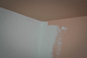
It was too light on the front door (hence the aforementioned mixing), but I thought it would be perfect for the kitchen. I eagerly made the purchase and headed home. Of course, I couldn’t start until after little missy was in bed, but I painted above the cabinets on the smallest wall in the kitchen. Then, I stepped back to admire it and to my horror it was like highlighter blue! I had Ansen confirm that it was much too neon to continue being in our kitchen and this would simply not work. The picture simply doesn’t do the neon justice.
That’s when I realized that I had actually purchased semi-gloss instead of the satin or eggshell that I normally get. I don’t know what I was thinking. I guess that it’s a kitchen and more gloss means easier to clean? So I tried a patch with the sample (which was satin) just to see.
You can see it around the outside of the corner. It was better… but not great. So not only was the sheen wrong, but the color was just too bright! In a small dish, I added some gray from our chevron office and tried several variations until I achieved one I was pretty happy with. I painted a decent swatch on a piece of paper and headed, with my open paint can back to Lowes.
Of course, they told me that they don’t return paint, but that they might be able to do something for me. After several managers got involved, they decided it would be easier to just give me a new gallon of paint than to go through the hassle of the “love your color” guarantee that Valspar is known for. I am grateful. They got the lower sheen and they color matched me little swatch.
So I painted a section… and sadly, it looked really dark. Disappointed, I wasn’t really sure what to do. I didn’t really feel like I could take it back yet again, because I knew this time, they would be less inclined to work with me. So I decided to give it a little faith and paint the entire section. I think the reason it looked so dark was because I painted it next to the neon blue and the sun would have looked dark next to it! (It’s the darkest swatch on the wall.)
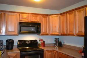
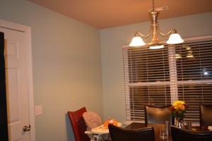
Thankfully, after getting it on some walls, I am actually in love with this color. It’s a calmer version of the tranquility. It has a little more green and brown, which works perfectly with the contractor tan that we’re leaving on one wall, the ceiling and the connecting living room. And after several weeks of working (and pulling out and cleaning behind appliances, gross!) I can finally say, it’s finished!
Notice that big empty space above Avie’s seat? Yeah, well, I have a special project for it. But that’s another post!


